Spotify:
Song Recognition
A built-in song recognition feature allows Spotify users to identify and save music playing around them in real time—without leaving the app.
Tasks:
- UX/UI Design, Visual Design, Prototype, Wireframe
Tools:
- Adobe Illustrator, Adobe Photoshop, Figma,
Duration:
- 2 weeks
Enhancing User Experience
Overview
Problem
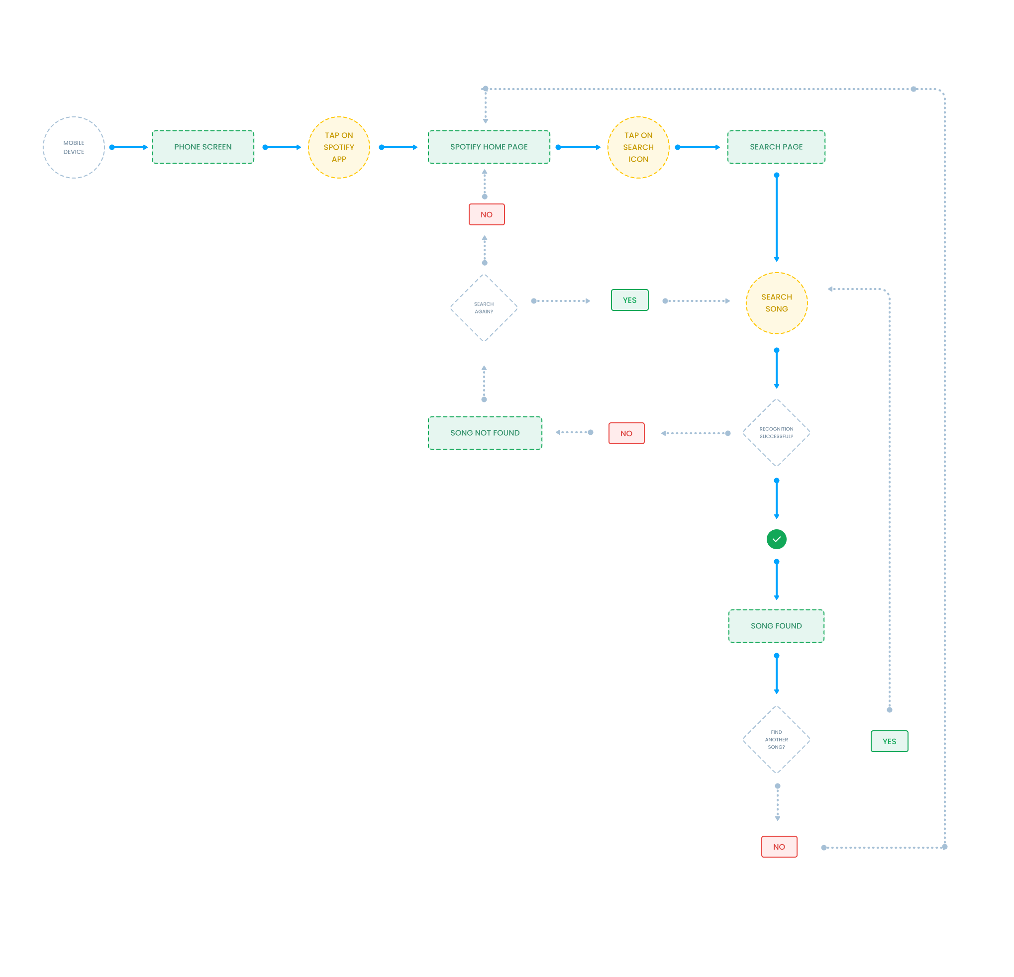
User Flow
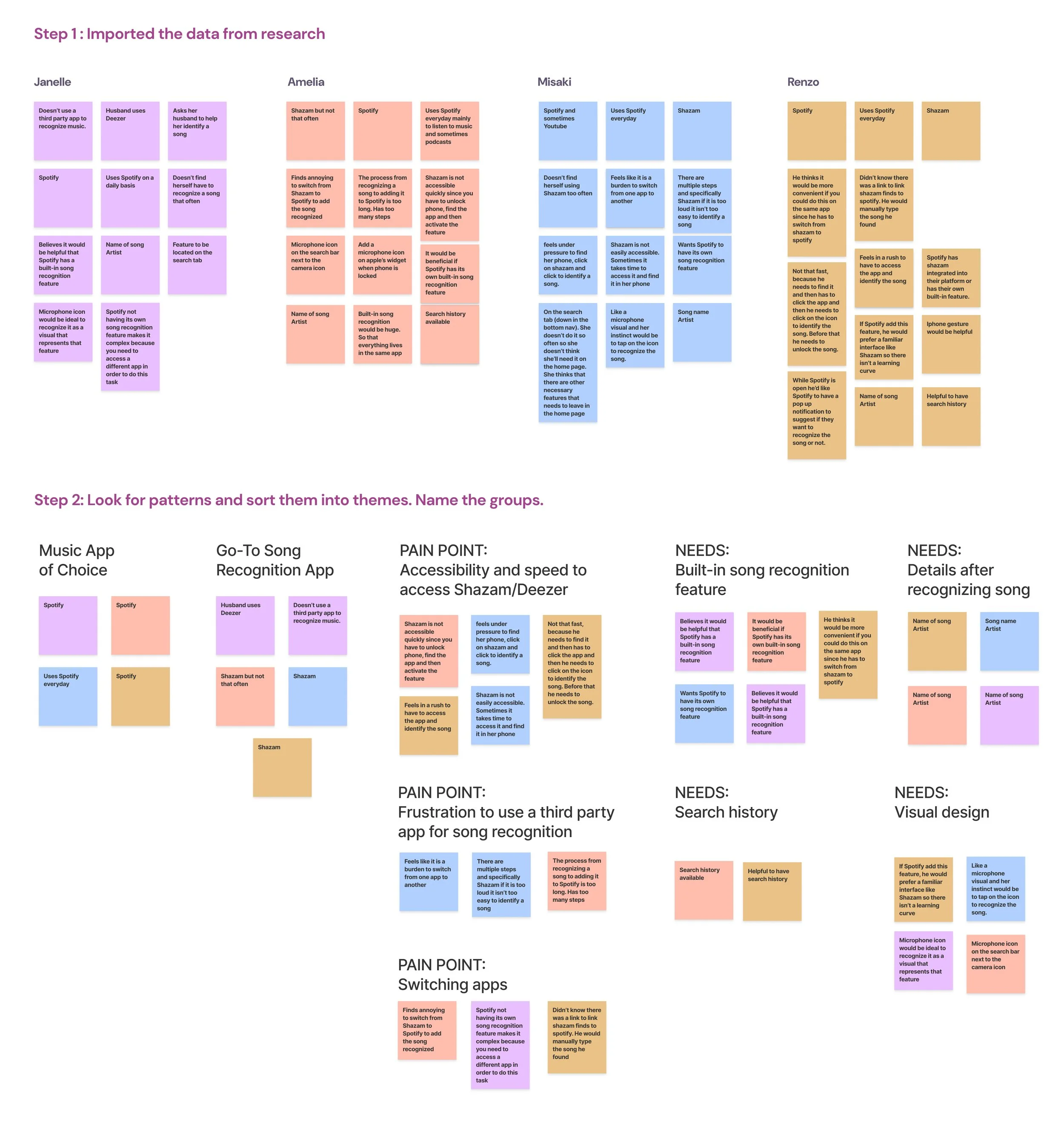
Understanding the Users
Spotify is the world’s largest audio streaming platform, offering music, podcasts, and audiobooks to over 600 million users across 180+ countries. With a freemium model—free with ads or paid for ad-free listening—Spotify provides access to millions of tracks, exclusive podcasts, and curated playlists, serving over 250 million premium subscribers as of early 2025.
Spotify users face frustration when identifying songs: they must leave the app to use Shazam, rush to recognize a track before it ends, and often forget previously discovered songs. This creates a fragmented and stressful experience. The challenge is to design a seamless in-app solution that allows users to quickly identify songs, add them to playlists, and easily access their search history—all without leaving Spotify.
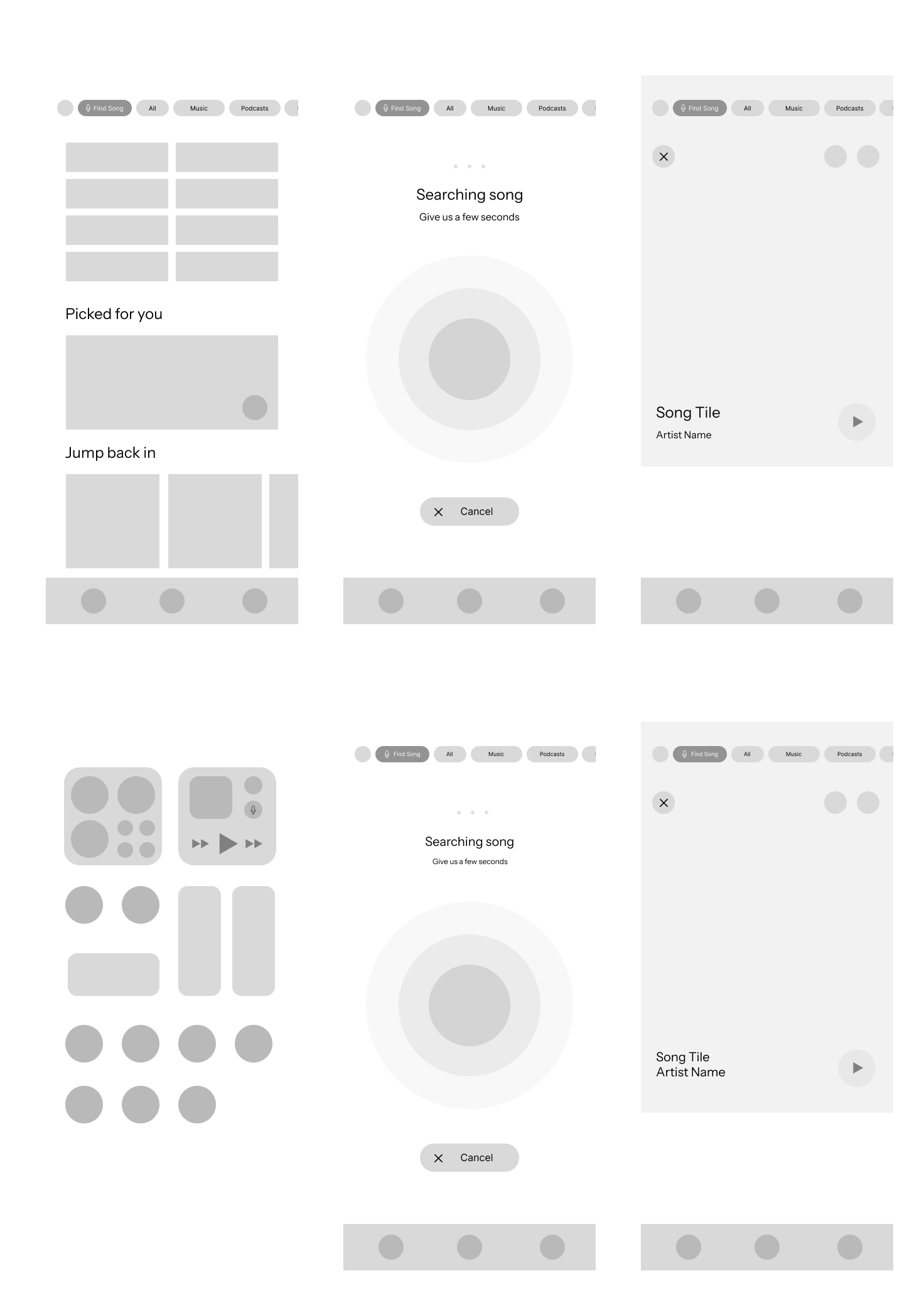
Low Fidelity Wireframes
Users find switching between Spotify and apps like Shazam inconvenient, time-consuming, and sometimes stressful.
Quick access is critical, especially when discovering songs on the go (e.g., while driving).
Forgetting identified songs is common; users want an easy way to save and revisit tracks.
A built-in Spotify recognition feature is highly preferred to streamline the experience.
Intuitive placement is key: search tab, top search bar, or a microphone icon are ideal locations.
Users value minimal onboarding—simple pop-ups or notifications are sufficient.
Essential feature outputs: song name, artist, save to playlist, and search history; lyrics or sharing are less important.
Overall, users want a fast, seamless, and frictionless experience that integrates discovery and playlist management within Spotify.
This user flow outlines the step-by-step process for using Spotify’s song recognition feature, from identifying a track to saving it to a playlist.
Using insights from user research and interviews, I created low-fidelity wireframes to visualize the proposed song recognition feature and explore how it could be seamlessly integrated into Spotify’s interface.
Users quickly understood the purpose of the song recognition feature once located.
Placement on the Search page outperformed the Homepage: faster task completion (4–6s vs 9–12s), higher success, and no observed errors.
Homepage placement caused hesitation; users didn’t associate song recognition with the home feed and often navigated to Search first.
Users’ mental models align with placing song recognition under Search, making it intuitive and efficient.
Recommendations: prioritize Search page placement, use a distinct icon with short microcopy (“Identify a song”), and consider optional secondary access or tooltip if retained on the Homepage.
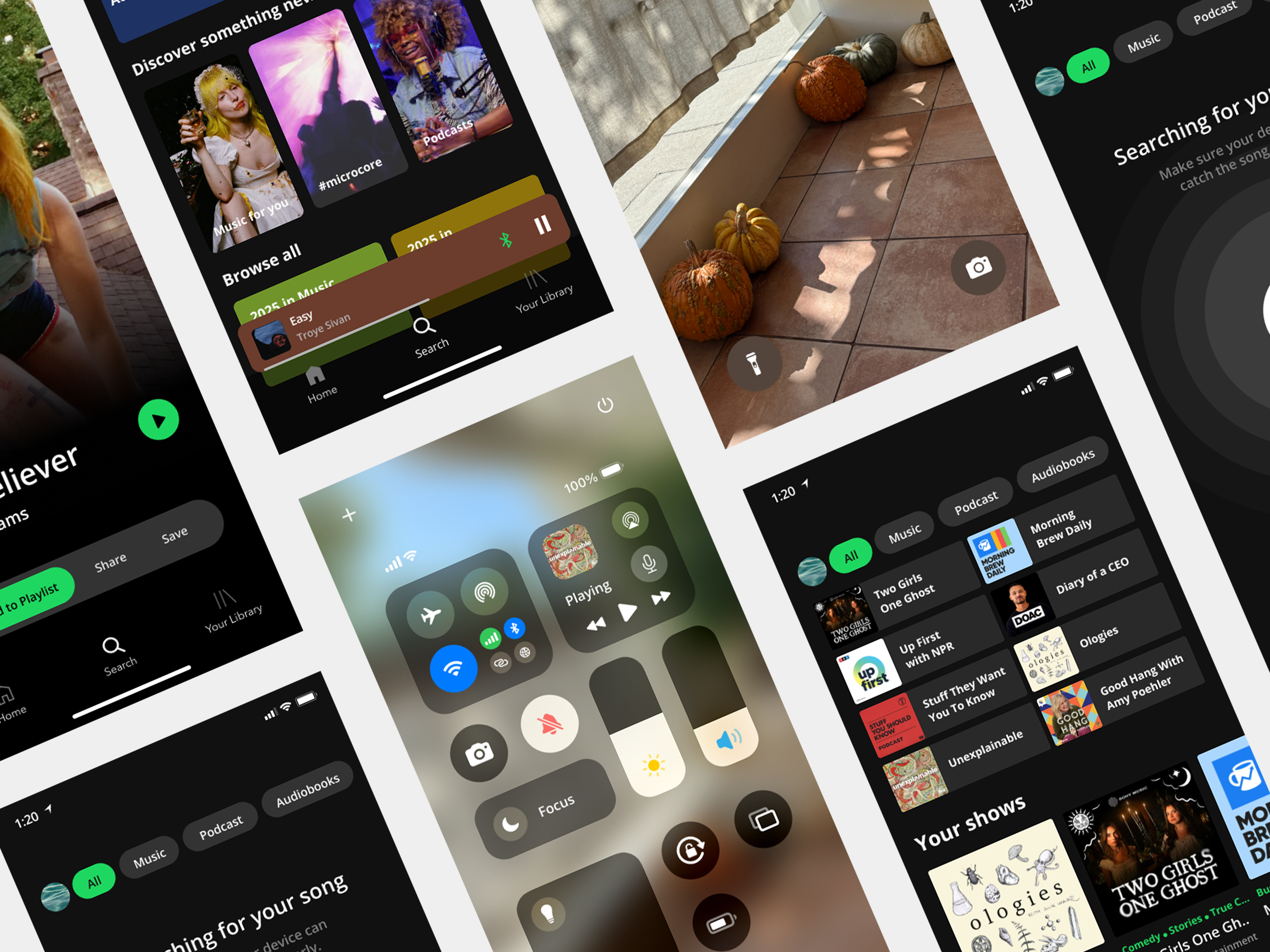
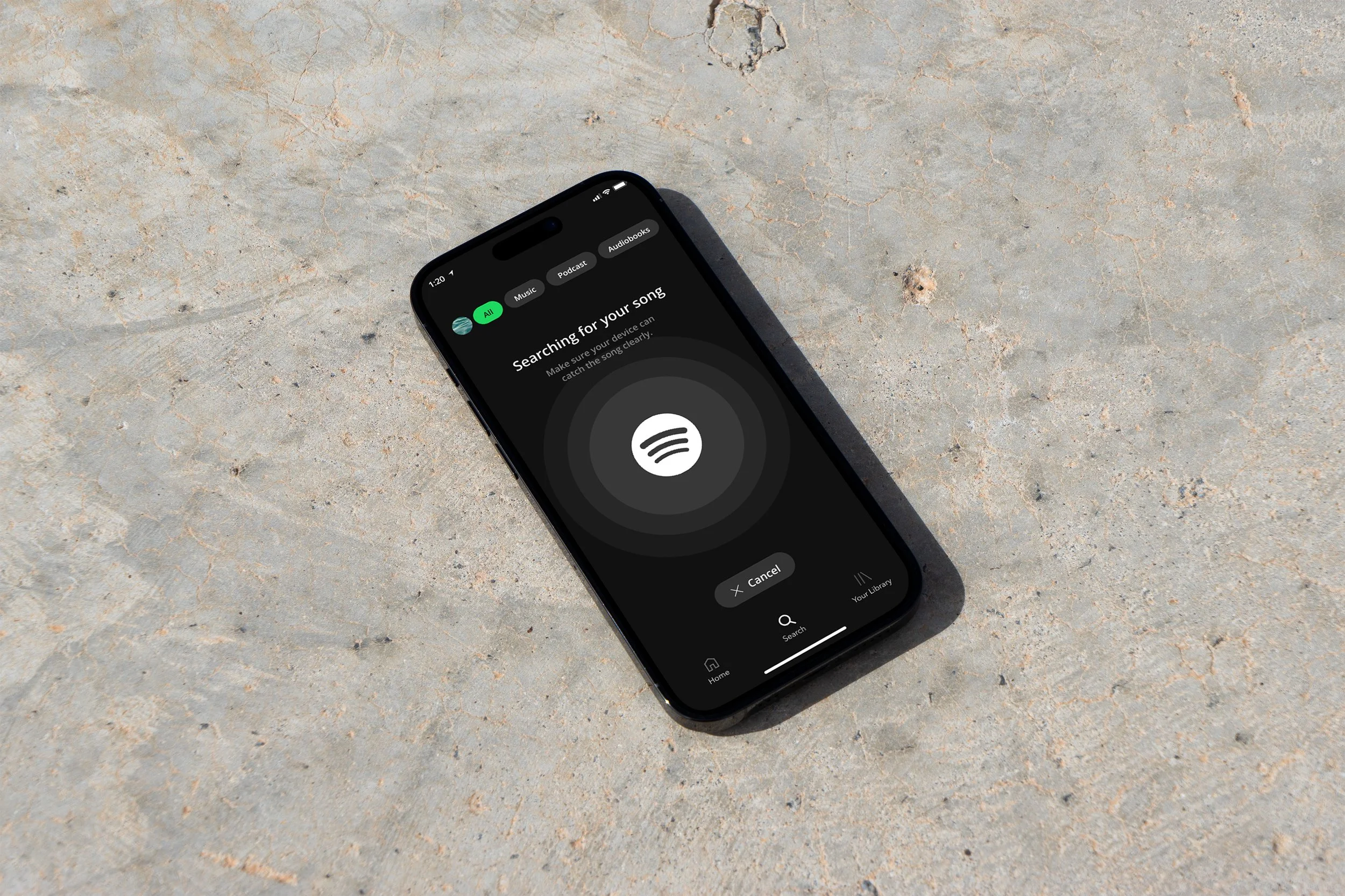
High Fidelity Wireframes
Based on insights from our user research, we found that users want to access the new feature as quickly and seamlessly as possible. To address the primary need for a built-in song recognition feature within Spotify, we explored two potential solutions:
Integrating the song recognition feature into the Search tab
Adding the feature as a lock screen widget for quick access without unlocking the phone
Search Tab Solution
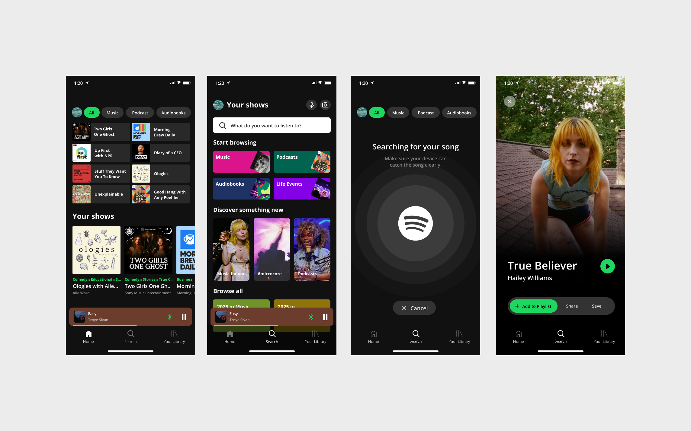
Widget Solution
Key Usability Insights
Strengthened skills in analyzing existing products and identifying meaningful feature additions.
Learned how to integrate a new feature seamlessly into a well-established app without disrupting core functionality.
Gained insight into user behavior: users prefer an intuitive, single-app experience for song recognition rather than switching between apps.
Usability testing highlighted the importance of feature placement, leading to a data-driven decision to locate the feature on the Search page.
Reinforced the value of A/B testing and validating assumptions with real users rather than relying on personal intuition.
Developed high-fidelity wireframes that align with the app’s existing design system, ensuring the feature feels native and polished.
Learned to balance speed, accessibility, and user expectations while maintaining a clean and non-intrusive interface.
Project Takeaways
This project was a key milestone in my growth as a UX designer.
Strengthened my ability to analyze an existing product and identify meaningful feature opportunities grounded in user research.
Learned how to strategically integrate a new feature into a well-established design system without disrupting core functionality.
Discovered the importance of validating assumptions through usability testing rather than relying on personal preference.
Used A/B testing to evaluate feature placement and prioritize user intuition over initial design instincts.
Gained deeper understanding of how small UI decisions can significantly impact efficiency and user experience.
Reinforced a research-driven, iterative mindset that will guide my growth as a thoughtful UX designer.