Responsive Website
A professional website for an emerging mental health therapist to establish credibility and support client acquisition.
Tasks:
- User Experience Design, User Interface Design, and Brand Design
Tools:
- Adobe Illustrator, Adobe Photoshop, and Figma
Duration:
- 4 weeks
Overview
Problem
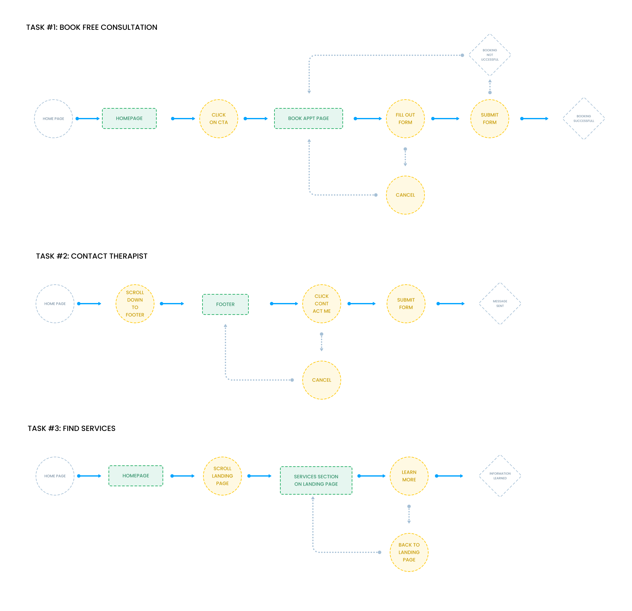
User Flows
Interview Findings
Understanding the Users
User interviews involved usability testing of existing therapist websites to uncover key pain points and highlight effective aspects of the user experience.
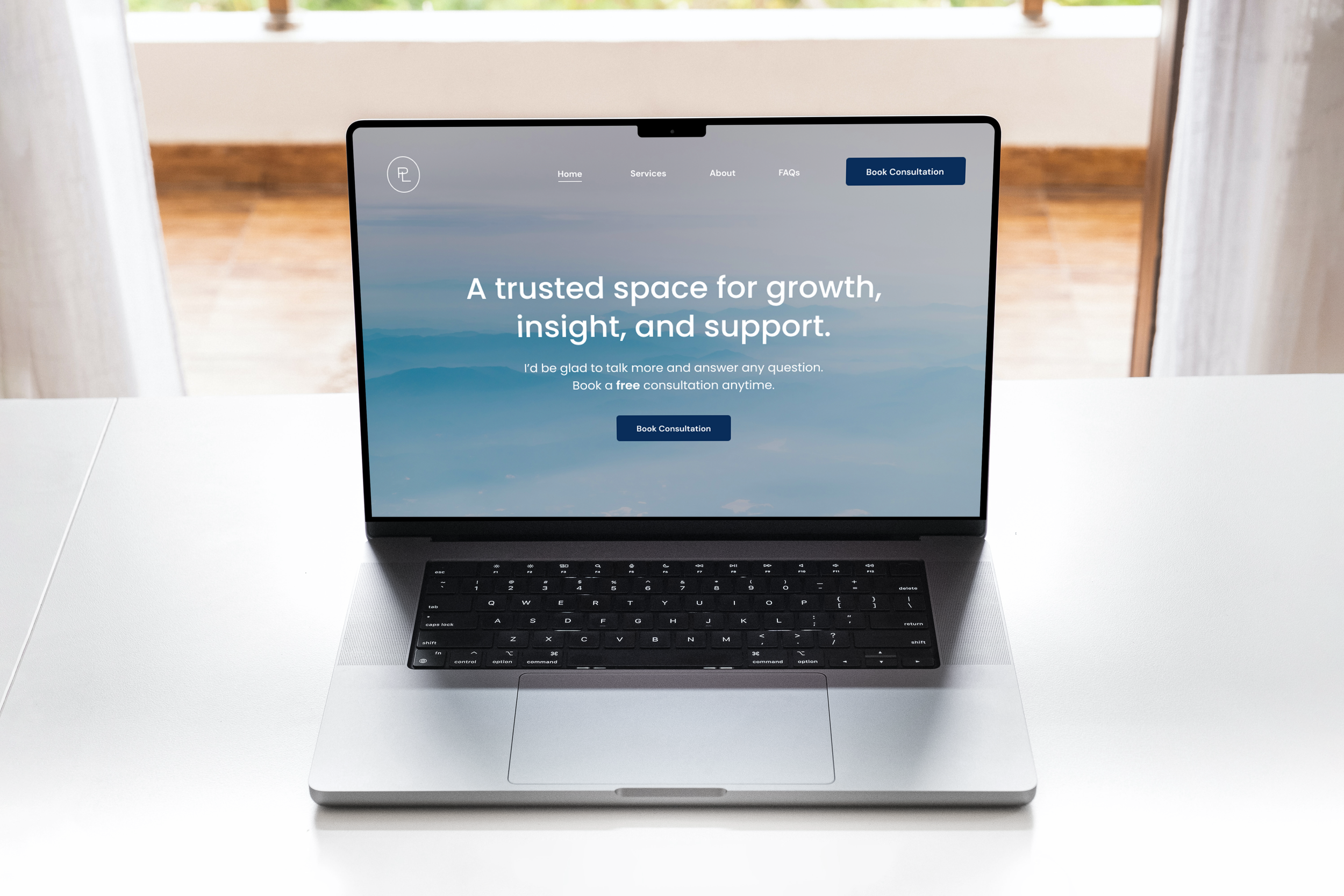
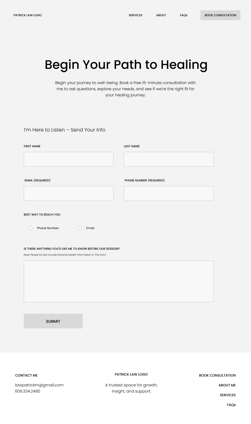
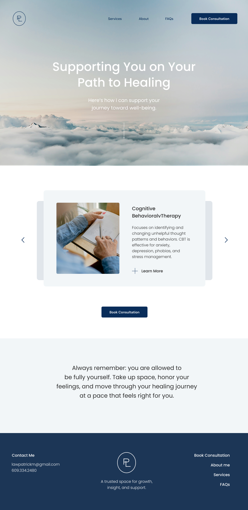
Designed a professional website for an emerging mental health therapist, focusing on building trust, credibility, and ease of access for potential clients. I created a user-centered platform that clearly communicates his background and expertise, offers valuable educational content, and integrates a seamless booking system to simplify the process of scheduling therapy sessions.
Many mental health provider websites lack a seamless, intuitive user experience, forcing potential clients to navigate unnecessary friction that makes booking and information-gathering feel overwhelming. In addition, inconsistent visual design can undermine trust—an essential factor when a website often serves as a client’s first impression of what working with that therapist might feel like.
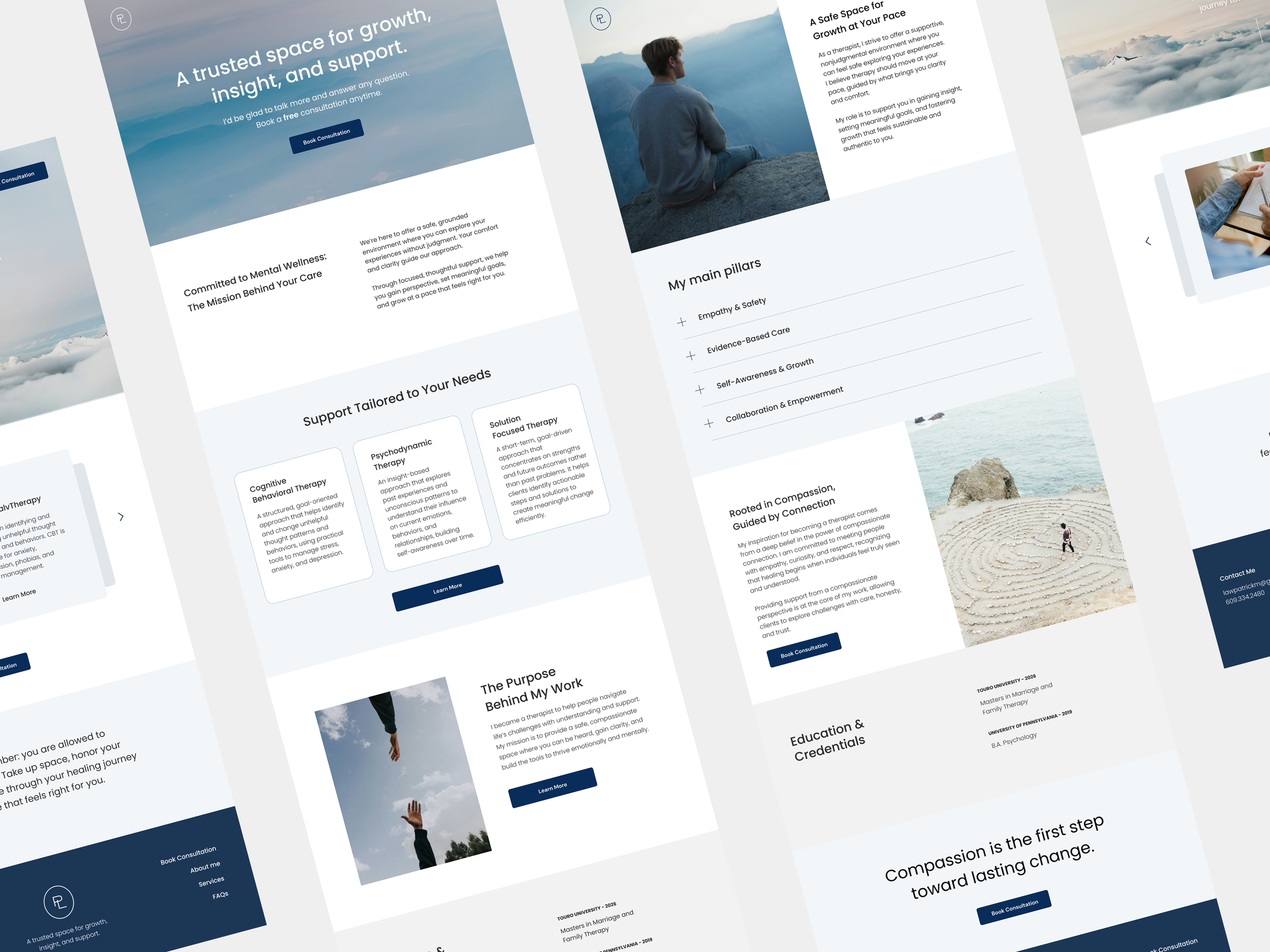
Low & Mid Fidelity Wireframes
To fully understand the challenges and requirements of both the client and potential users, I conducted in-depth research to uncover their needs, expectations, and pain points—ensuring the website solution aligned with user goals while meeting the client’s objectives.
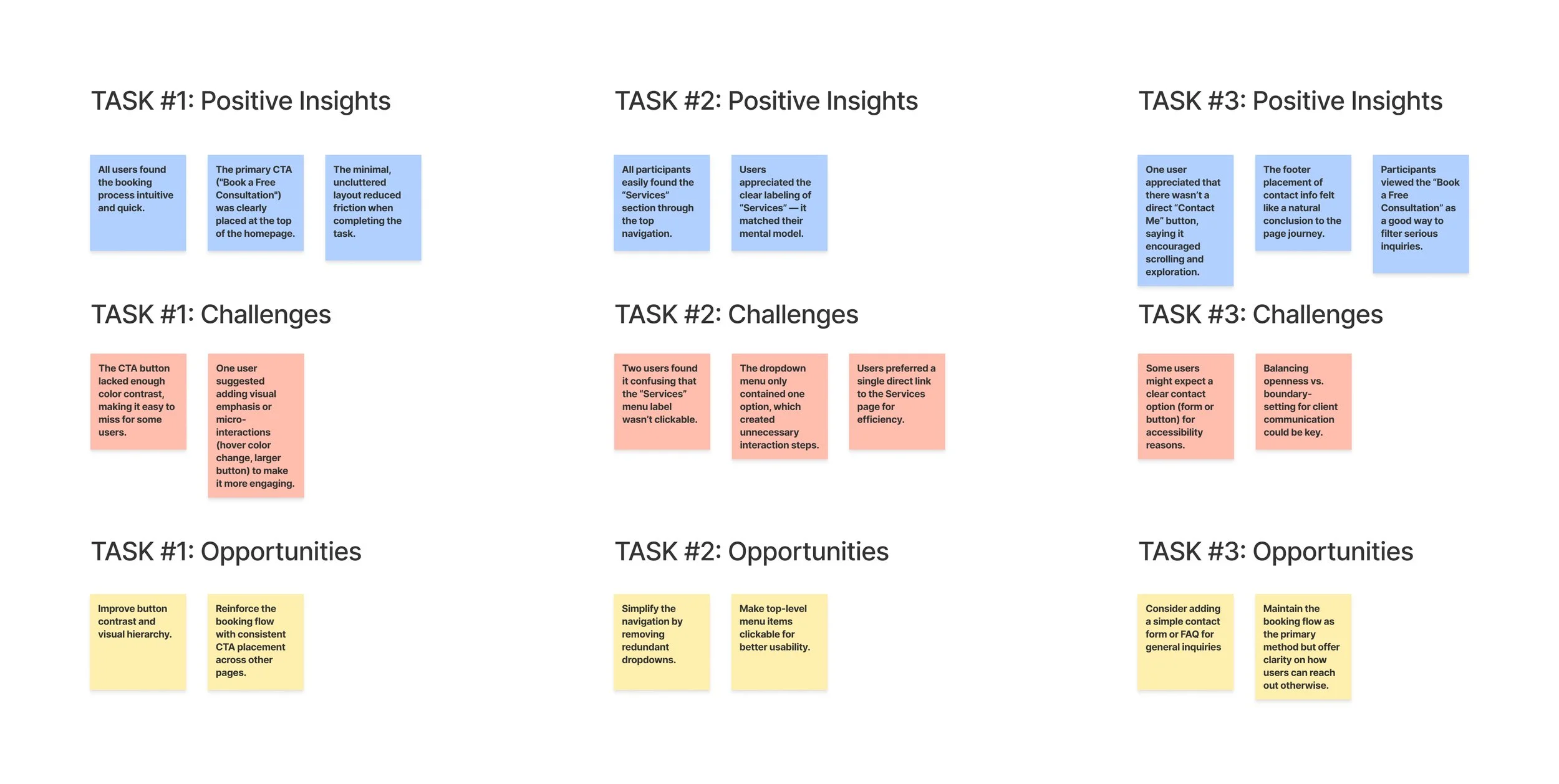
User Interview Findings
The user interviews were conducted through usability testing of existing therapist websites to identify both the challenges and strengths of their current user experiences.
High task completion rate across all three tasks; users described the experience as clean and intuitive.
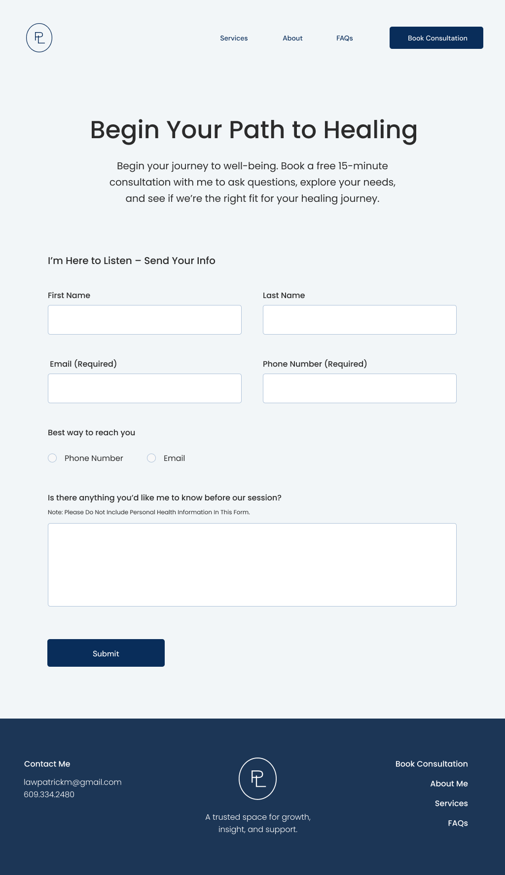
The “Book a Free Consultation” CTA was clear and easy to follow, though one participant suggested stronger color contrast to improve visibility.
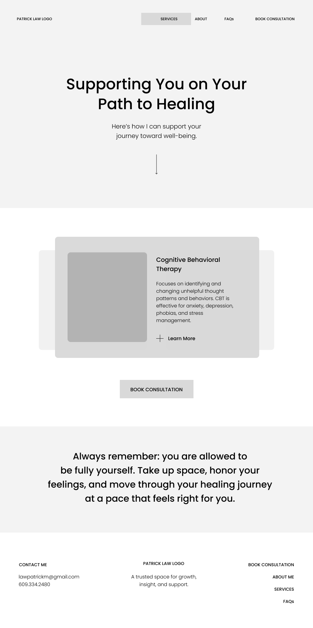
The Services navigation was easy to find, but two users found the dropdown unnecessary and slightly confusing, recommending a single direct link instead.
The contact flow encouraged users to book a consultation rather than email directly, which supported a more intentional and streamlined inquiry process.
Client Interview Findings
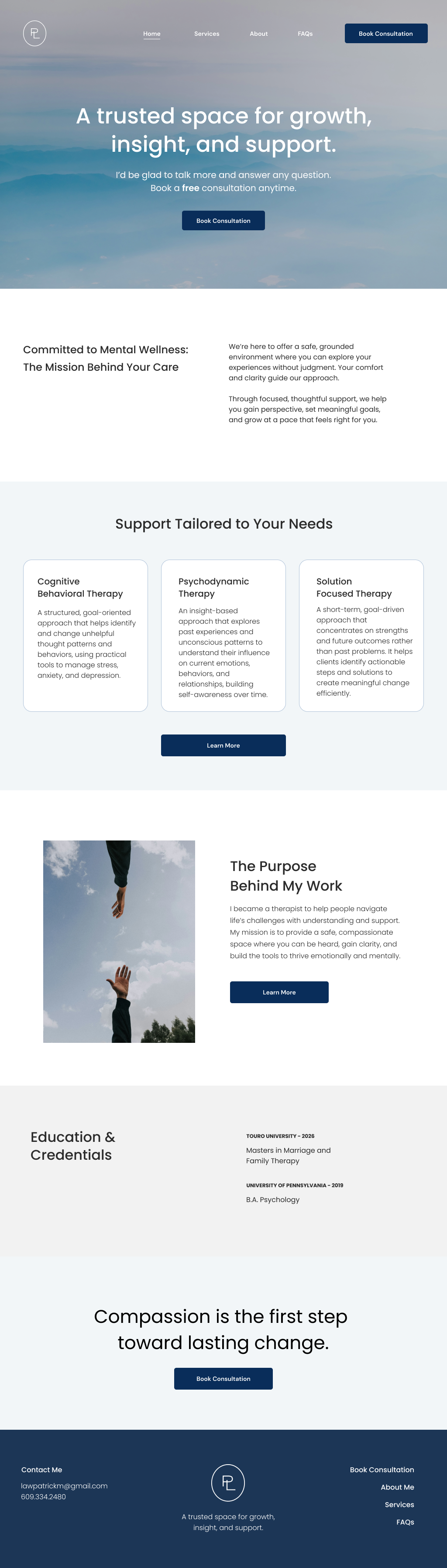
Goal to establish credibility and trust as an emerging mental health therapist.
Needed a professional platform to clearly showcase education, qualifications, and experience.
Wanted to share educational content and blog posts to position himself as knowledgeable and approachable.
Prioritized an integrated online booking system to simplify scheduling and reduce back-and-forth communication.
Emphasized the importance of a design that feels calm, welcoming, and trustworthy to reflect the therapy experience.
Sought a streamlined structure that balances professionalism with warmth and accessibility
Drawing from user interviews and secondary research, I designed low- and mid-fidelity wireframes for the responsive website to plan the structure and craft a user-centered experience that follows UX best practices.
Building on the insights from low-fidelity usability testing and the established brand system, we enhanced the wireframes by improving both their visual design and functionality.
High-Fidelity Wireframes
Actionable Revisions
Consider adding a subtle “Contact” link in the navigation
Reinforce footer visibility with visual separation
Add reassurance microcopy near booking CTA (e.g., “Free consultation”)
“Maybe add a small contact button near the bottom of the page, even if it’s secondary.”